Powerful UI/UX Design Boosted Predators Lacrosse
The UI/UX Design Challenge: A Growing Brand, But an Outdated Experience for Non-Techy Users
Predators Lacrosse had built a strong presence in the local sports scene, uniting youth athletes, supportive parents, and passionate coaches under one energetic brand. But despite their momentum on the field, their digital presence was lagging behind.
Their biggest audience—parents—often found the website confusing and hard to navigate. Most of them weren’t tech-savvy and just wanted to quickly access practice schedules, registration forms, or team updates. Instead, they were met with an outdated design, poor mobile usability, and a menu structure that felt more like an obstacle course than a support system.
The mobile experience was even worse—key links were hidden, buttons were too small, and pages took too long to load. As a result, many users gave up or turned to phone calls and emails for support, creating more work for the Predators team and reducing operational efficiency.
That’s when they turned to Creatopia Digital Marketing, a full-service creative agency specializing in UI/UX design, to help them turn things around.
The Goal: UI/UX Web Design That Works for Real People

From the start, it was clear that this wasn’t just a visual redesign. Predators Lacrosse needed a UX web design strategy that would:
-
Simplify the website structure for non-techy users
-
Improve the mobile experience and accessibility
-
Increase registrations, sign-ups, and event attendance
-
Reflect the energy and professionalism of their growing brand
Our Approach: A Proven UI/UX Design Framework
At Creatopia, we don’t believe in guesswork. Our UI/UX Design services are rooted in research, empathy, and performance-based strategy. We followed a five-phase process used by top-tier UX agencies to deliver lasting results:
-
User Research and Discovery
-
UX Strategy and Information Architecture
-
Wireframing and Prototyping
-
UI Design and Visual Identity
-
Testing, Optimization, and Launch
Phase 1: Discovery – Empathizing with Non-Techy Parents
The discovery phase began with deep listening. Through conversations with the Predators Lacrosse team and a review of user behavior data, we identified their core users: parents who value simplicity and speed.
Key pain points included:
-
Getting lost in the navigation
-
Difficulty finding registration or team info
-
Frustrating mobile experience
-
Inconsistent design that didn’t inspire confidence
We created user personas and mapped out their goals: find schedules, register kids for programs, and stay updated. This empathy-driven research allowed us to design with purpose, not assumptions.
Phase 2: UX Strategy – Organizing the Experience
With clear personas and journeys in hand, we developed a new information architecture designed around user behavior—not internal team preferences.
Highlights of Our UX Strategy:
-
Simple, intuitive navigation bar with parent-friendly labels
-
Clean, prioritized layout with the most-used actions front and center
-
Dedicated landing pages for programs, teams, and schedules
-
Mobile-first structure to support quick access anytime, anywhere
By applying best practices in UX services, we laid the foundation for a digital experience that felt effortless and inviting.
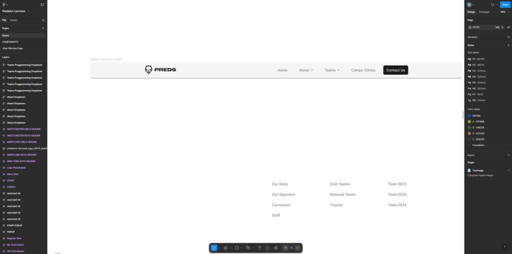
Phase 3: Wireframing and Prototyping – Designing With Clarity
Before jumping into the visual design, we created interactive wireframes to define the layout, flow, and structure of key pages. This step allowed us to test ideas quickly and involve the Predators team in the process.
These prototypes helped us answer:
-
Are users able to get where they need in under 3 clicks?
-
Do CTAs like “Register Now” or “View Schedule” stand out?
-
Is it easy to switch between team info, events, and contact details?
By testing the wireframes early, we reduced the risk of design missteps later on and ensured the site’s usability was rock-solid before visual polish.
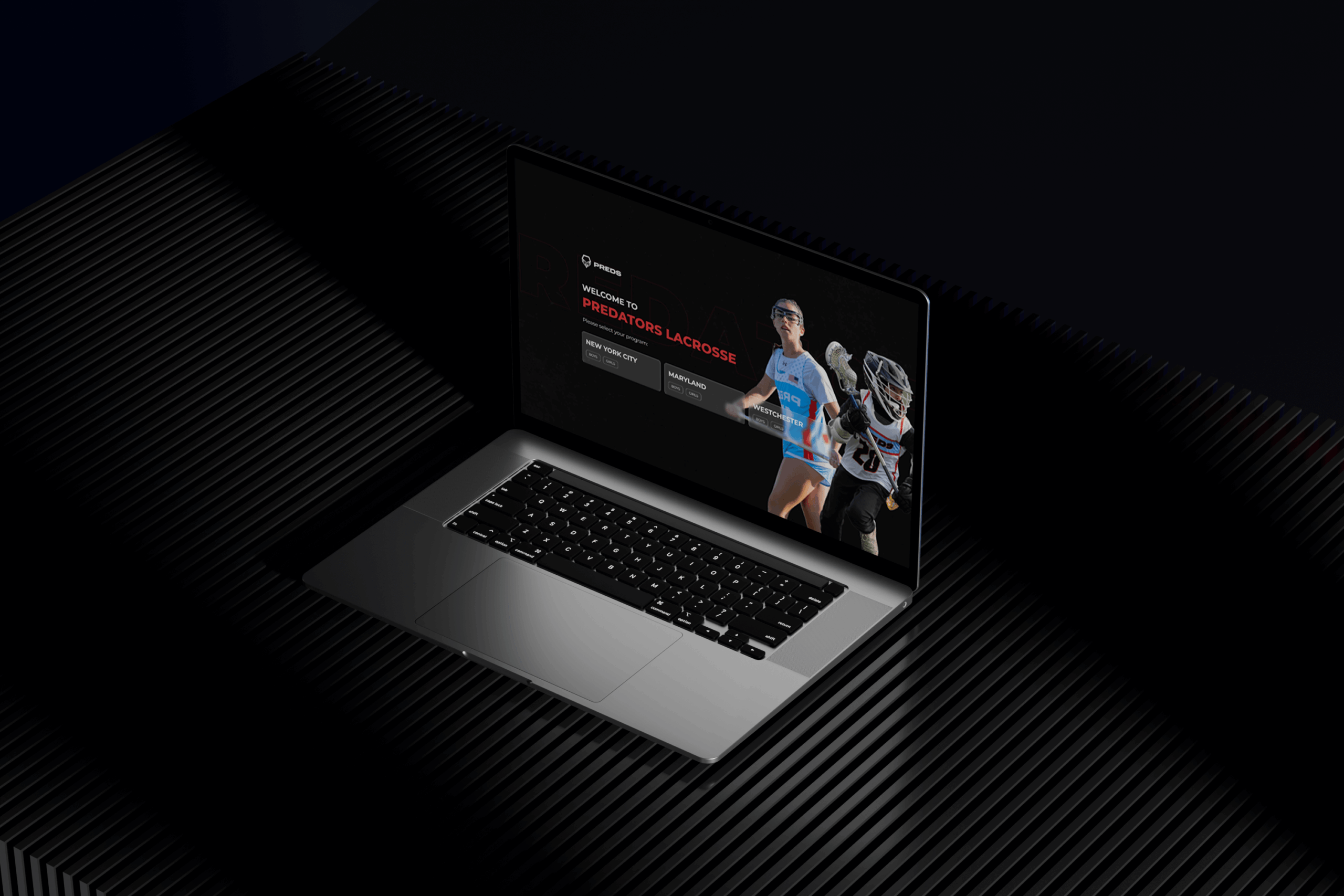
Phase 4: UI Design – Bringing the Brand to Life
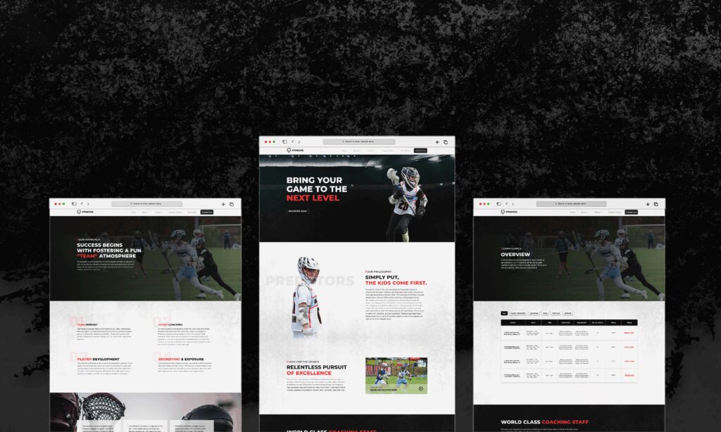
Once the structure was finalized, we moved to high-fidelity UI design that blended performance with visual storytelling.
We focused on:
-
Bold and energetic color palettes that reflect the team’s athletic spirit
-
Large, clickable buttons and CTAs optimized for mobile interaction
-
Clear typography and clean spacing to reduce overwhelm
-
Authentic imagery featuring real team members in action
This wasn’t just design for design’s sake—it was conversion-focused UI/UX design. Every visual decision had a functional purpose: guide the user and increase engagement.
Phase 5: Testing, Optimization, and Launch – UX That Performs
Prior to launch, we performed extensive testing across devices and browsers to ensure accessibility, speed, and consistency.
Post-launch, we monitored analytics and user feedback to fine-tune the experience.
-
120% increase in user registrations
-
60% reduction in bounce rate
-
85% improvement in mobile usability scores
- 4.5x conversion rate
-
Higher user satisfaction from parents and staff alike
By applying our full-stack UI/UX design services, we helped Predators Lacrosse go from a frustrating experience to a functional, friendly, and high-performing digital platform.
Client Feedback: Built for the Community
“Creatopia completely understood our audience. Most of our parents aren’t techy, and they created something so simple and beautiful that anyone can use it. It’s been a total game-changer.”
— Predators Lacrosse Leadership Team
Why This Case Study Matters for Modern Businesses
Predators Lacrosse’s success is a great example of how UX web design can solve real-world problems. It’s not just about trendy visuals or flashy animation. It’s about giving users what they need—quickly, clearly, and confidently.
Our UI/UX services are built for:
-
Community organizations with large, diverse audiences
-
Non-profits and sports programs seeking more digital impact
-
Growing businesses that need conversion-focused design
Key Takeaways from Our UX Design Process
-
Design empathy first: We designed specifically for non-tech-savvy users
-
Keep structure simple: Clear IA and user flows lead to lower friction
-
Always mobile-first: The majority of users access on phones
-
Test before launch: Wireframes and feedback saved time later
-
Track and optimize: Post-launch data gave us key insights to improve
Ready to Elevate Your UX? Let’s Build Together
At Creatopia Digital Marketing, our UI/UX design services are more than just a deliverable—they’re a partnership. Whether you’re running a local sports league or scaling an online brand, we build digital experiences that deliver.
Contact us today to see how we can help your business grow with smart, human-centered design.
| KPI | Before Engagement | After Engagement |
| User Registrations | Low & inconsistent | ↑ 120% Increase |
| Bounce Rate | Very High (frequent drop-offs) | ↓ 60% Reduction |
| Mobile Usability Score | Poor (low accessibility rating) | ↑ 85% Improvement |
| Conversion Rate | 1x (minimal actions taken) | 4.5x (significant user actions) |
| User Satisfaction | Complaints & confusion | Overwhelmingly positive feedback |